Auto Miles Per Gallon Data Experiments
This notebook runs the experiments and generates the figures on the auto mpg data. We are working with a subset of the data created by:
- selecting a subset of columns to suit our problem setting: three continuous (mpg, acceleration, and horsepower) and three categorical attributes (cylinders, model year, and origin)
- removing incomplete records
This notebook generates the results and figures related to the AutoMPG experiments
In [1]:
import numpy as np
import pandas as pd
import seaborn as sns
import matplotlib.colors as mcolors
import matplotlib.pyplot as plt

# clean up notebook output by removing warnings about future changes
import warnings
warnings.simplefilter(action='ignore', category=FutureWarning)

# our code packaged for easy use
import detect_simpsons_paradox as dsp
In [2]:
# import the prepared copy of the data
auto_df = pd.read_csv('../../../data/auto2.csv')
auto_df.head()
Out[2]:
| mpg | cylinders | horsepower | acceleration | model year | origin | |
|---|---|---|---|---|---|---|
| 0 | 18.0 | 8 | 130.0 | 12.0 | 70 | 1 |
| 1 | 15.0 | 8 | 165.0 | 11.5 | 70 | 1 |
| 2 | 18.0 | 8 | 150.0 | 11.0 | 70 | 1 |
| 3 | 16.0 | 8 | 150.0 | 12.0 | 70 | 1 |
| 4 | 17.0 | 8 | 140.0 | 10.5 | 70 | 1 |
From examining the above, we know that the integer columns are the group-by variables and the float type variables are the continuous attributes. The detector function will automatically
In [3]:
groupbyAttrs = auto_df.select_dtypes(include=['int64'])
groupbyAttrs_labels = list(groupbyAttrs)
print(groupbyAttrs_labels)
['cylinders', 'model year', 'origin']
In [4]:
continuousAttrs = auto_df.select_dtypes(include=['float64'])
continuousAttrs_labels = list(continuousAttrs)
print(continuousAttrs_labels)
['mpg', 'horsepower', 'acceleration']
Results
Now we can run our algorithm and print out the results after a little bit of post-processing to improve readability.
In [5]:
# run detection algorithm
result_df = dsp.detect_simpsons_paradox(auto_df)

# Map attribute index to attribute name
result_df['attr1'] = result_df['attr1'].map(lambda x:continuousAttrs_labels[x])
result_df['attr2'] = result_df['attr2'].map(lambda x:continuousAttrs_labels[x])
# sort for easy reading
result_df = result_df.sort_values(['attr1', 'attr2'], ascending=[1, 1])

# data frames print neatly in notebooks
result_df
Out[5]:
| allCorr | attr1 | attr2 | reverseCorr | groupbyAttr | subgroup | |
|---|---|---|---|---|---|---|
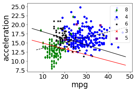
| 1 | 0.423329 | mpg | acceleration | -0.818873 | cylinders | 3 |
| 3 | 0.423329 | mpg | acceleration | -0.341214 | cylinders | 6 |
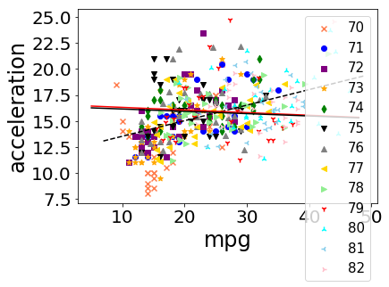
| 4 | 0.423329 | mpg | acceleration | -0.050545 | model year | 75 |
| 5 | 0.423329 | mpg | acceleration | -0.051280 | model year | 79 |
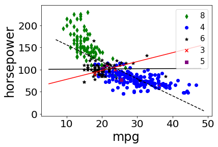
| 0 | -0.778427 | mpg | horsepower | 0.620807 | cylinders | 3 |
| 2 | -0.778427 | mpg | horsepower | 0.013135 | cylinders | 6 |
Plotting
We plot all data in scatter plots based on each group by attribute, for each pair of candidate attributes. For each plot we add the overall trendline and the trend line for each occurence of Simpson’s Paradox.
In [6]:
print(auto_df.cylinders.unique())
print(auto_df['model year'].unique())
[8 4 6 3 5]
[70 71 72 73 74 75 76 77 78 79 80 81 82]
In [7]:
fig = plt.figure()
colors = {'3':'red', '4':'blue', '5':'purple', '6':'black','8':'green'}
markers = {'3':'x', '4':'o', '5':'s','6':'*','8':'d'}

#plt.scatter(auto_df['mpg'], auto_df['acceleration'], c=auto_df['cylinders'].apply(lambda x: colors[str(x)]))
for i in range(len(auto_df['mpg'])):
    plt.scatter(auto_df['mpg'][i], auto_df['acceleration'][i], c=colors[str(auto_df['cylinders'][i])], marker=markers[str(auto_df['cylinders'][i])], label=auto_df['cylinders'][i])

plt.xlabel('mpg',  fontsize=24)
plt.ylabel('acceleration', fontsize=24)
plt.xticks(fontsize = 20)
plt.yticks(fontsize = 20)

#import matplotlib.patches as mpatches
#red_patch = mpatches.Patch(color='red', label='3')
#green_patch = mpatches.Patch(color='blue', label='4')
#purple_patch = mpatches.Patch(color='purple', label='5')
#black_patch = mpatches.Patch(color='black', label='6')
#green_patch = mpatches.Patch(color='green', label='8')
#plt.legend(handles=[red_patch, green_patch, blue_patch,black_patch,orange_patch])

from collections import OrderedDict
handles, labels = plt.gca().get_legend_handles_labels()
by_label = OrderedDict(zip(labels, handles))
plt.legend(by_label.values(), by_label.keys(), prop={'size':15})

# Add correlation line
axes = plt.gca()
x = auto_df['mpg']
y = auto_df['acceleration']

m, b = np.polyfit(x, y, 1)
X_plot = np.linspace(axes.get_xlim()[0],axes.get_xlim()[1],100)
plt.plot(X_plot, m*X_plot + b, '--',color='black')

cylinder3 = auto_df[auto_df['cylinders'] ==3]
cylinder6 = auto_df[auto_df['cylinders'] ==6]
x1 = cylinder3['mpg']
y1 = cylinder3['acceleration']

m1, b1 = np.polyfit(x1, y1, 1)
#print(axes.get_xlim()[0])
#print(axes.get_xlim()[1])
X_plot1 = np.linspace(5,48,100)
plt.plot(X_plot1, m1*X_plot1 + b1, '-', color='red')

x2 = cylinder6['mpg']
y2 = cylinder6['acceleration']

m, b = np.polyfit(x2, y2, 1)
X_plot = np.linspace(5,48,100)
plt.plot(X_plot, m*X_plot + b, '-', color='black')

plt.show()

#fig.savefig('auto1.jpg')
In [8]:
fig = plt.figure()
colors = {'70':'coral', '71':'blue', '72':'purple', '73':'orange','74':'green', '75':'black', '76':'grey','77':'gold', '78':'lightgreen','79':'red', '80':'cyan', '81':'skyblue','82':'pink'}
markers = {'70':'x', '71':'o', '72':'s','73':'*','74':'d', '75':'v', '76':'^','77':'<', '78':'>','79':'1', '80':'2', '81':'3','82':'4'}

#plt.scatter(auto_df['mpg'], auto_df['acceleration'], c=auto_df['cylinders'].apply(lambda x: colors[str(x)]))
for i in range(len(auto_df['mpg'])):
    plt.scatter(auto_df['mpg'][i], auto_df['acceleration'][i], c=colors[str(auto_df['model year'][i])], marker=markers[str(auto_df['model year'][i])], label=auto_df['model year'][i])


#plt.scatter(auto_df['mpg'], auto_df['acceleration'], c=auto_df['model year'].apply(lambda x: colors[str(x)]))

plt.xlabel('mpg',  fontsize=24)
plt.ylabel('acceleration', fontsize=24)
plt.xticks(fontsize = 20)
plt.yticks(fontsize = 20)
#import matplotlib.patches as mpatches
#patch1 = mpatches.Patch(color='coral', label='70')
#patch2 = mpatches.Patch(color='blue', label='71')
#patch3 = mpatches.Patch(color='purple', label='72')
#patch4 = mpatches.Patch(color='orange', label='73')
#patch5 = mpatches.Patch(color='green', label='74')
#patch6 = mpatches.Patch(color='black', label='75')
#patch7 = mpatches.Patch(color='grey', label='76')
#patch8 = mpatches.Patch(color='gold', label='77')
#patch9 = mpatches.Patch(color='lightgreen', label='78')
#patch10 = mpatches.Patch(color='red', label='79')
#patch11 = mpatches.Patch(color='cyan', label='80')
#patch12 = mpatches.Patch(color='skyblue', label='81')
#patch13 = mpatches.Patch(color='pink', label='82')

#plt.legend(handles=[patch1, patch2, patch3,patch4,patch5,patch6, patch7, patch8,patch9,patch10,patch11, patch12, patch13])
from collections import OrderedDict
handles, labels = plt.gca().get_legend_handles_labels()
by_label = OrderedDict(zip(labels, handles))
plt.legend(by_label.values(), by_label.keys(), prop={'size':15})


# Add correlation line
axes = plt.gca()
x = auto_df['mpg']
y = auto_df['acceleration']

m, b = np.polyfit(x, y, 1)
X_plot = np.linspace(axes.get_xlim()[0],axes.get_xlim()[1],100)
plt.plot(X_plot, m*X_plot + b, '--',color='black')

cylinder3 = auto_df[auto_df['model year'] ==75]
cylinder6 = auto_df[auto_df['model year'] ==79]
x1 = cylinder3['mpg']
y1 = cylinder3['acceleration']

m1, b1 = np.polyfit(x1, y1, 1)
#print(axes.get_xlim()[0])
#print(axes.get_xlim()[1])
X_plot1 = np.linspace(5,48,100)
plt.plot(X_plot1, m1*X_plot1 + b1, '-', color='red')

x2 = cylinder6['mpg']
y2 = cylinder6['acceleration']

m, b = np.polyfit(x2, y2, 1)
X_plot = np.linspace(5,48,100)
plt.plot(X_plot, m*X_plot + b, '-', color='black')

plt.show()

#fig.savefig('auto2.jpg')
In [9]:
fig = plt.figure()
colors = {'3':'red', '4':'blue', '5':'purple', '6':'black','8':'green'}
markers = {'3':'x', '4':'o', '5':'s','6':'*','8':'d'}

for i in range(len(auto_df['mpg'])):
    plt.scatter(auto_df['mpg'][i], auto_df['horsepower'][i], c=colors[str(auto_df['cylinders'][i])], marker=markers[str(auto_df['cylinders'][i])], label=auto_df['cylinders'][i])

#plt.scatter(auto_df['mpg'], auto_df['horsepower'], c=auto_df['cylinders'].apply(lambda x: colors[str(x)]))

plt.xlabel('mpg',  fontsize=24)
plt.ylabel('horsepower', fontsize=24)
plt.xticks(fontsize = 20)
plt.yticks(fontsize = 20)
#import matplotlib.patches as mpatches
#red_patch = mpatches.Patch(color='red', label='3')
#green_patch = mpatches.Patch(color='blue', label='4')
#purple_patch = mpatches.Patch(color='purple', label='5')
#black_patch = mpatches.Patch(color='black', label='6')
#green_patch = mpatches.Patch(color='green', label='8')
#plt.legend(handles=[red_patch, green_patch, blue_patch,black_patch,orange_patch])
from collections import OrderedDict
handles, labels = plt.gca().get_legend_handles_labels()
by_label = OrderedDict(zip(labels, handles))
plt.legend(by_label.values(), by_label.keys(), prop={'size':15}, loc = 1)


# Add correlation line
axes = plt.gca()
x = auto_df['mpg']
y = auto_df['horsepower']

m, b = np.polyfit(x, y, 1)
X_plot = np.linspace(axes.get_xlim()[0],axes.get_xlim()[1],100)
plt.plot(X_plot, m*X_plot + b, '--',color='black')

cylinder3 = auto_df[auto_df['cylinders'] ==3]
cylinder6 = auto_df[auto_df['cylinders'] ==6]
x1 = cylinder3['mpg']
y1 = cylinder3['horsepower']

m1, b1 = np.polyfit(x1, y1, 1)
#print(axes.get_xlim()[0])
#print(axes.get_xlim()[1])
X_plot1 = np.linspace(5,48,100)
plt.plot(X_plot1, m1*X_plot1 + b1, '-', color='red')

x2 = cylinder6['mpg']
y2 = cylinder6['horsepower']

m, b = np.polyfit(x2, y2, 1)
X_plot = np.linspace(5,48,100)
plt.plot(X_plot, m*X_plot + b, '-', color='black')

plt.show()

#fig.savefig('auto3.jpg')