What is Simpson’s Paradox?
An overview of Simpson’s Paradox in the cases that we address in this project and how to detect it as well as breif complexity analysis of the problem
In [1]:
import numpy as np
import pandas as pd
import matplotlib.pylab as plt
import seaborn as sns

# for outputting all alone variables
# from IPython.core.interactiveshell import InteractiveShell
# InteractiveShell.ast_node_interactivity = "all"
It’s generally discussed in terms of two variables, both discrete, though binary or mulit level cases are both poputlar. A popular example is the berkeley admissions data set. the claim was that it was iased againt women because t the univerisyt sclae it ws, but fom os depeartments they actually admitted wmen at much higher rates but the departments tha had low aceptance rates wer the ones with most of the women applicants
Regression Based SImpson’s Paradox
It can manifest in how a decision variable relates to others that \(x_k\) is predicted differently for different values of \(x_j\) another way Simpson’s Paradox could manifest is through latent clusters. It can manifest in relationsships among variables.
In [2]:
#
N = 100
# sample data from 2 clusters
mu = np.asarray([[1,1],[5,5]])

z = np.random.randint(0,2,N)
x = np.asarray([np.random.multivariate_normal(mu[z_i],[[.6,-1],[0,.6]]) for z_i in z])

latent_df = pd.DataFrame(data=x,
                       columns = ['x1', 'x2'])

# now we add somoe more columns
color_z = {0:'r', 1:'b'}
char_zy = {0: {0:'x', 1:'o'}, 1:{0:'o', 1:'x'}}

latent_df['color'] = [color_z[z_i] for z_i in z]
y = np.random.choice([0,1],N,p=[.7,.3])
latent_df['y'] = y
latent_df['char'] = [char_zy[zi][yi] for zi,yi in zip(z,y)]
/home/smb/anaconda2/envs/simpsonsparadox/lib/python3.6/site-packages/ipykernel_launcher.py:7: RuntimeWarning: covariance is not positive-semidefinite.
  import sys
In [3]:
sns.lmplot('x1','x2', data=latent_df, hue='color', ci=None,
               markers =['x','o'], palette="Set1")
# adda whole data regression line, but don't cover the scatter data
sns.regplot('x1','x2', data=latent_df, color='black', scatter=False, ci=None)
Out[3]:
<matplotlib.axes._subplots.AxesSubplot at 0x7f1e220959b0>

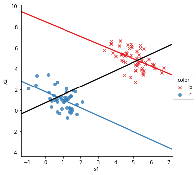
in this, if we ignore the color, x_1 and x_2 are posiiely correlate, show by the black line, but in each color, they’re negatively correlated. This is a type of plot that we will want to generate a lot, so we’ve included it in the package
In [4]:
from sp_data_util import sp_plot

sp_plot(latent_df, 'x1','x2','color')

In [5]:
latent_df['x1'].corr(latent_df['x2'])
latent_df.groupby('color')['x1','x2'].corr()
Out[5]:
| x1 | x2 | ||
|---|---|---|---|
| color | |||
| b | x1 | 1.00000 | -0.53890 |
| x2 | -0.53890 | 1.00000 | |
| r | x1 | 1.00000 | -0.50993 |
| x2 | -0.50993 | 1.00000 |
So, we can see that the correlation between \(x_1\) and \(x_2\) is positive in the whole data set and negative in each subgroup. This is Simpson’s paradox. So, to detect Simpson’s Paradox in a data set with \(d\) continuous variables and \(c\) discrete variables, we can compute correlation matrix for all of the data, one \(d \times d\) matrix. Then for each of the \(c\) discrete variables with \(k_c\) levels we compute an additional \(d \times d\) matrix$ for each level of each variable.
So, we need to compute \(1+ \sum_{i = 1}^c k_i\) correlation matrices of size \(d \times d\) and compare the signs of each element in the lower half of all the \(\sum_{i = 1}^c k_i\) for subgroup levels to the first one.